Colour in Architecture
Post written by Paul de Vries and Simon Droog. Follow us on Twitter.
New here at Experiencing Architecture and have no idea where to start? Just read our post on How to design atmospheres attuned to the concerns of the user to get you started.
This is another post from our series Architectural means. In this series we try to discover which means we have as architects to create atmospheres attuned to the concerns of the user. If you have any thoughts or things to add about colour in architecture after reading this, just drop us a line on Twitter.

Colour is a very powerful mean in architecture. Many books are written about the effect of colour, but they are not always telling us the same story. Contradictions can be easily found, because it is hard not to be subjective with such a topic. Another problem with making general conclusions is the fact that colours have different meanings in different cultures. For example, in most parts of Europe black is for mourning, though in northern parts of Portugal, and perhaps elsewhere in Europe as well, brides wear black gowns on their wedding day. In China and other parts of East Asia white is the colour of mourning and in most of Europe it is the colour of purity; worn by the bride at her wedding (KRESS, G. and VAN LEEUWEN, T (2002) – Colour as a semiotic mode: notes for a grammar of colour – free to download as pdf).

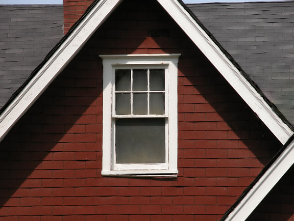
But it is still possible to make some general conclusions about the effects of colour. In Expression of material, we saw in the example of Fallingwater that light painted materials seem lighter than dark coloured materials. Other visual effects of colour can make things look further away or more distant; larger or smaller; cooler or warmer. For example, a cool blue bathroom and warm red living room. Association plays a very important role with experiencing colours; we do not only associate blue with cold water and red with fire, but also red shingles with bricks. And why do most Scandinavian people paint their wooden houses red or yellow? The Swedish art historian Erik Lundberg believes that the Scandinavian use of deep red paint on the exterior of houses is started as an imitation of the much grander red brick manor houses of the wealthy (from LUNDBERG, E. in RASMUSSEN, S.E (1964) – Experiencing Architecture, p. 216 – Amazon affiliate link). Later generations imitated stucco houses and their light colours, like the often used light yellow. Buildings are also painted to create a unity between different materials.

Colour can also have a very symbolic meaning. You can think about signals, national colours or uniform colours. Another interesting aspect of colour is their psychological and physiological effect on people, like the red tablecloth in a restaurant giving you an exiting feeling and letting your digestion work more, or the soothing effect of green (from RASMUSSEN, S.E. (1964) – Experiencing Architecture, p. 218 – affiliate link).
But how we experience colour depends on the surrounding colours, the level of saturation, and what kind of light falls on it. Rasmussen says about the light effect on colours: “Warm and cold colors play an important role in our lives and express very different moods and emotions. We experience them in the variations of daylight from morning to evening. It is true that the eye adjusts itself to the gradual change so that the local colors of details appear the same throughout the day. But if we observe the whole as a unit – a landscape or a street scene – we become aware of the changes in the color scheme. The entire mood changes with the changing light.” (from RASMUSSEN, S.E. (1964) – Experiencing Architecture, p. 221 – affiliate link).
Other Architectural Means
If you like our post on colour, go ahead and have a look at the other parts from our Architectural means series here > Architectural Means.
And if you have something to add from your own experience with colour, just drop us a line on Twitter.
